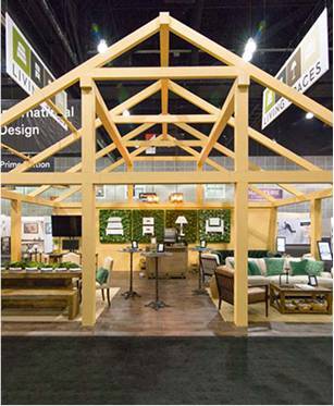
The Signature Line is a fully custom engineered display system built to perform show after show — while eliminating the hidden costs that eat your marketing budget every time you exhibit.
-Award-Winning Trade Show Display
WE DON'T JUST BUILD BOOTHS,
WE BUILD TRUST.
From ready-to-ship displays to fully custom exhibits — find the right solution for your brand.
Seamless execution. Real results.
FIND THE PERFECT SOLUTION
FOR YOUR TRADE SHOW PROGRAM
Buy Online
200+ pre-designed displays ready to ship in 3–5 days. Add your graphics, choose your size, and get to your next show fast.
Shop now →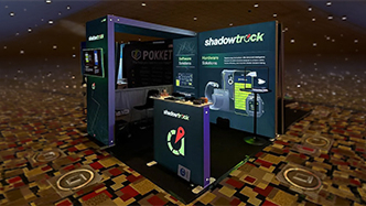
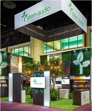
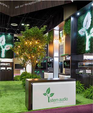
Signature Line
Custom engineered, tool-less displays built to reduce your labor, shipping, and drayage costs show after show.
Get a free rendering →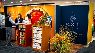
Rentals
Need a display for one show? Rent a premium exhibit without the ownership commitment. We handle the logistics — you just show up.
Schedule a consultation →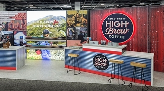
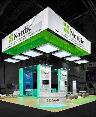
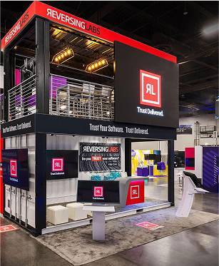
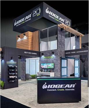
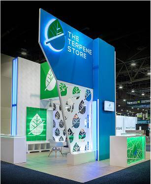
Custom Builds
Make a statement with a fully bespoke exhibit. Island booths, double decks, and large format builds designed to stop traffic on the show floor.
Schedule a consultation →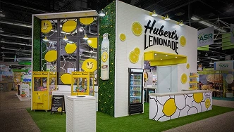
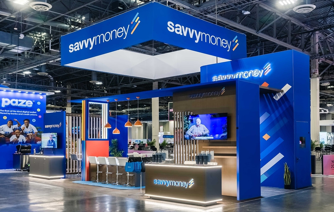
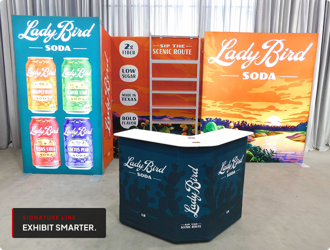
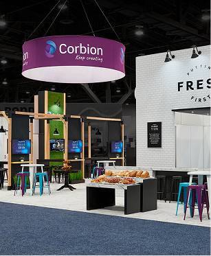
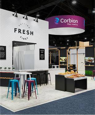
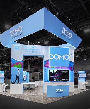
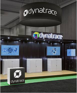
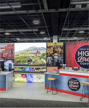
Some of our Happy Clients


Best Selling Products
Our most popular displays — ready to ship with your custom graphics in 3–5 business days.
Award Winning Booths

Request an Exhibit Design Call
Set up a virtual consultation
Book Call NowFrequent Asked Questions
Whether you're planning your first show or your fiftieth, we know you probably have questions. From how we stand out as a partner to whether you should rent or buy, we’ve answered some of the most common questions our clients ask. If you don’t see your question here, just reach out — we’re always happy to help.
At ExpoMarketing, you get the best of both worlds—the full-service capabilities of a large exhibit house with the personal attention and agility of a boutique partner. From Fortune 1000 brands to first-time exhibitors, every client receives tailored solutions, direct access to dedicated experts, and a team that treats your goals as their own. We don’t just build booths—we build trust. No matter the size or scope, we bring the same focus to strategy, craftsmanship, and results. That’s why over 99% of our clients choose to stay with us, year after year.
Renting is ideal if you exhibit occasionally, want flexibility in design, or need to minimize upfront costs. It’s also great for testing different layouts before committing. Buying makes sense if you exhibit frequently and want a long-term investment. There’s no one-size-fits-all answer — the right choice depends on your goals, budget, and how often you exhibit.
Yes! Our displays are designed to be flexible and modular, so you can easily update or replace individual graphic panels without reprinting the entire booth. It’s one of the reasons our clients love working with us — it’s cost-effective, customizable, and perfect for keeping your branding fresh.
Yes, we can accommodate rush projects in many cases — it depends on the type of display and customization required. If you see a booth you like on our website, feel free to ask if it can be expedited. We’ll do everything we can to meet your deadline.